
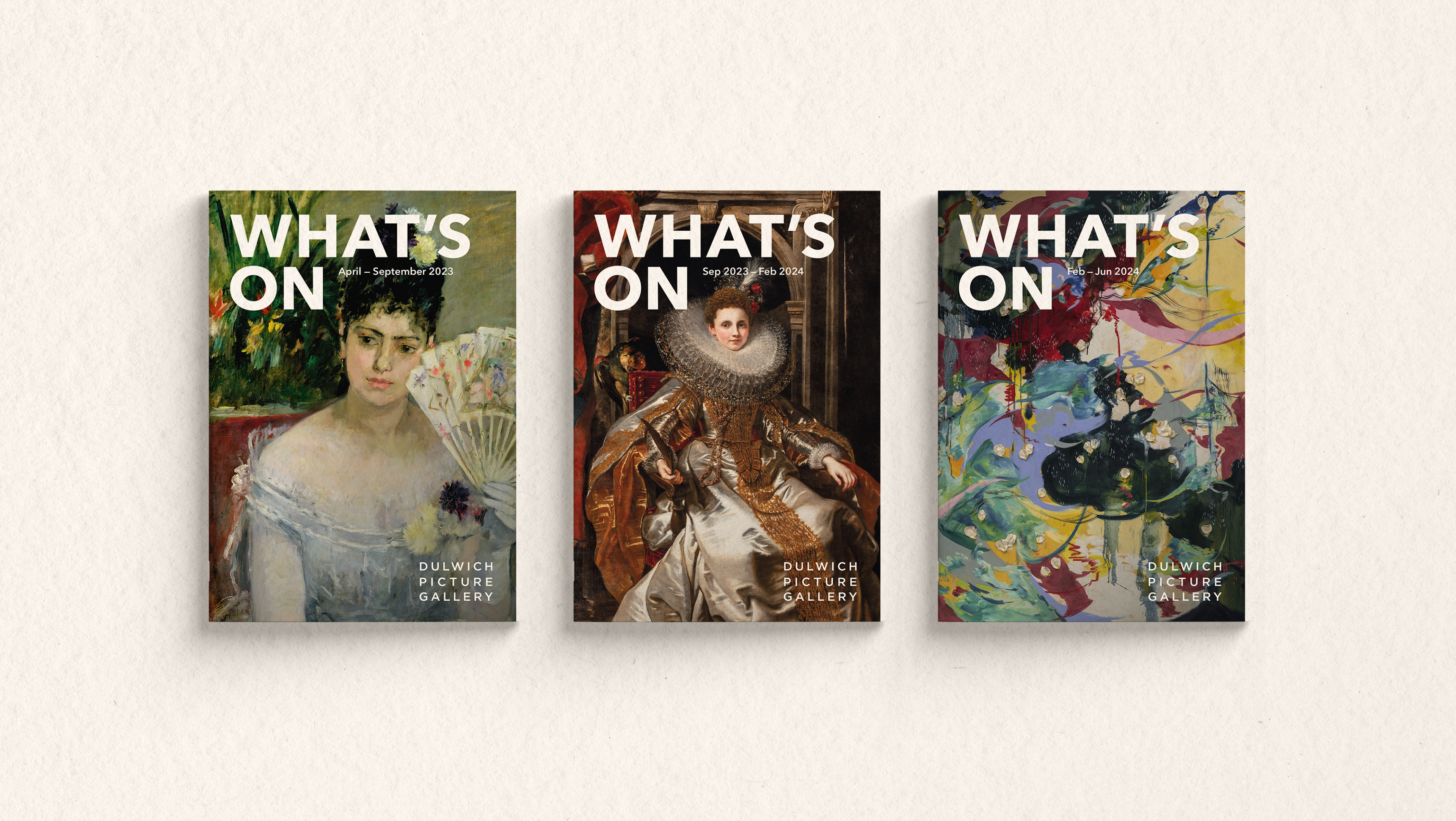
Front covers
Back story
Dulwich Picture Gallery wanted to take the opportunity of announcing a major new exhibition, and season of events, to completely re-design their exhibition guide.
They were keen for the new guide to be bold and confident, yet still recognisable to their loyal audience. They wanted clean, spacious layouts with photography playing a much more prominent role.
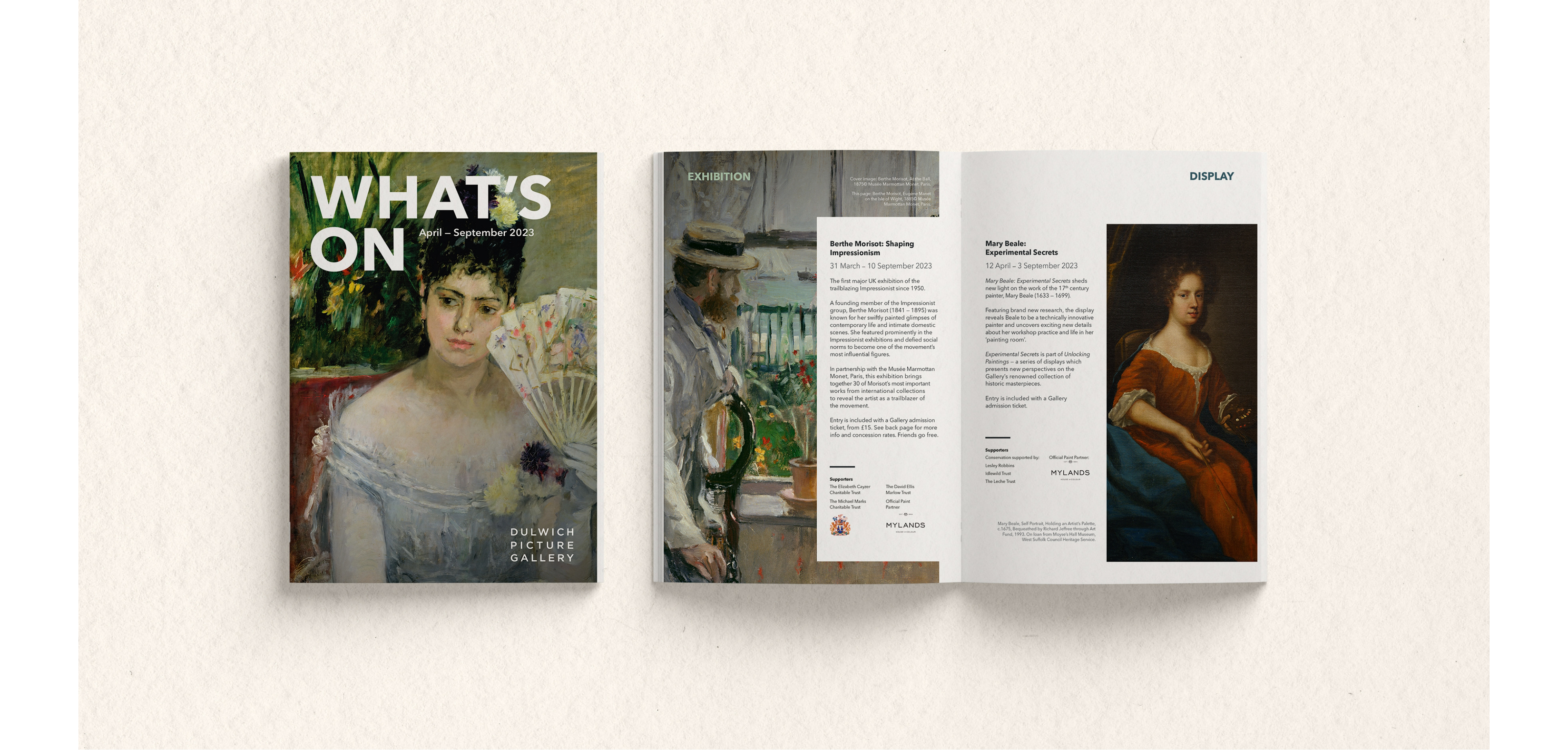
Summer edition – cover and initial spread
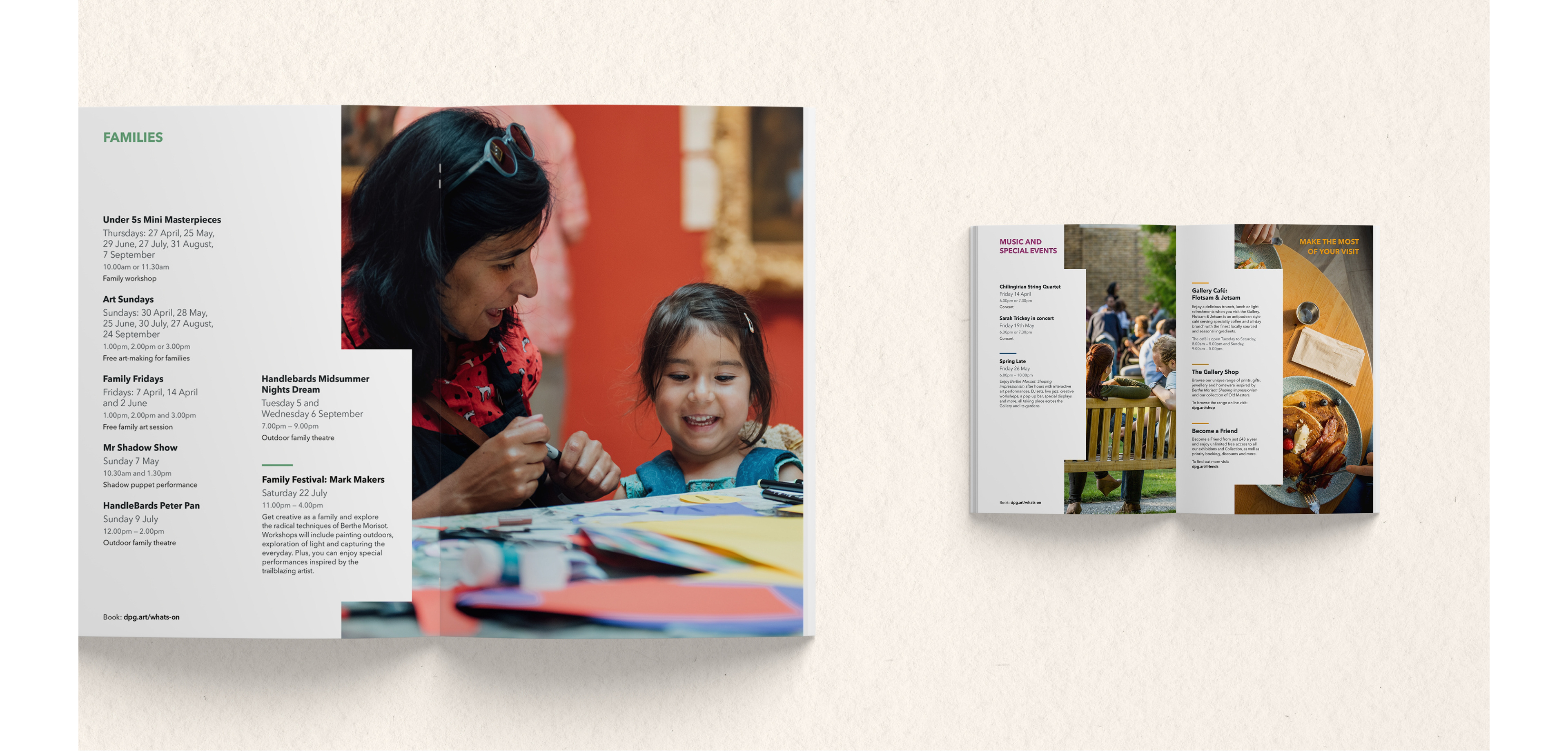
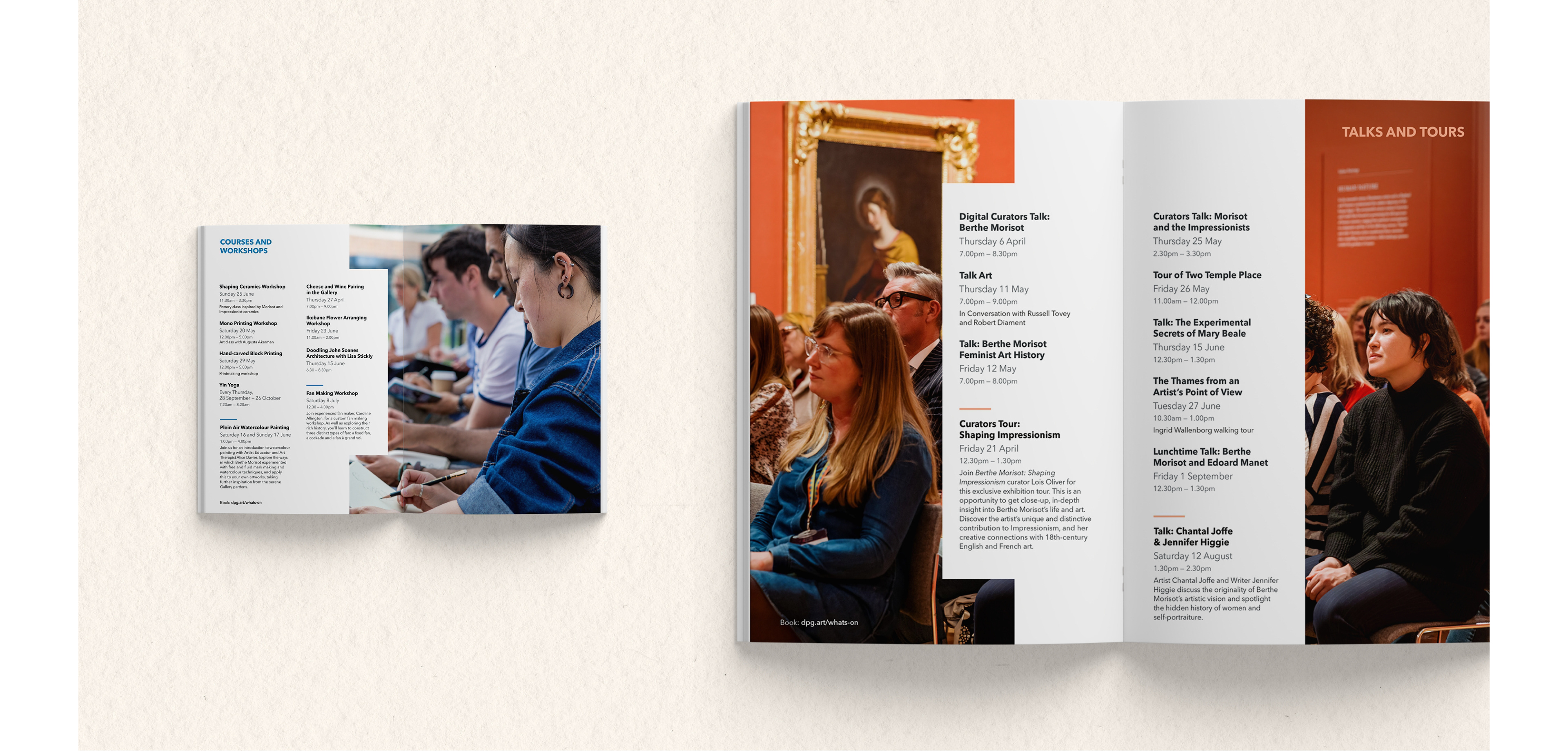
To support this ambition, photography played a key role in the composition of all layouts and was used large scale throughout. In order to balance the impact of the photography, 'cut-outs' were used as a device to introduce white space and allow room for content to breathe comfortably.
The resulting outcome is a confident, engaging and impactful design that has been used as a basis for guides across multiple seasons.
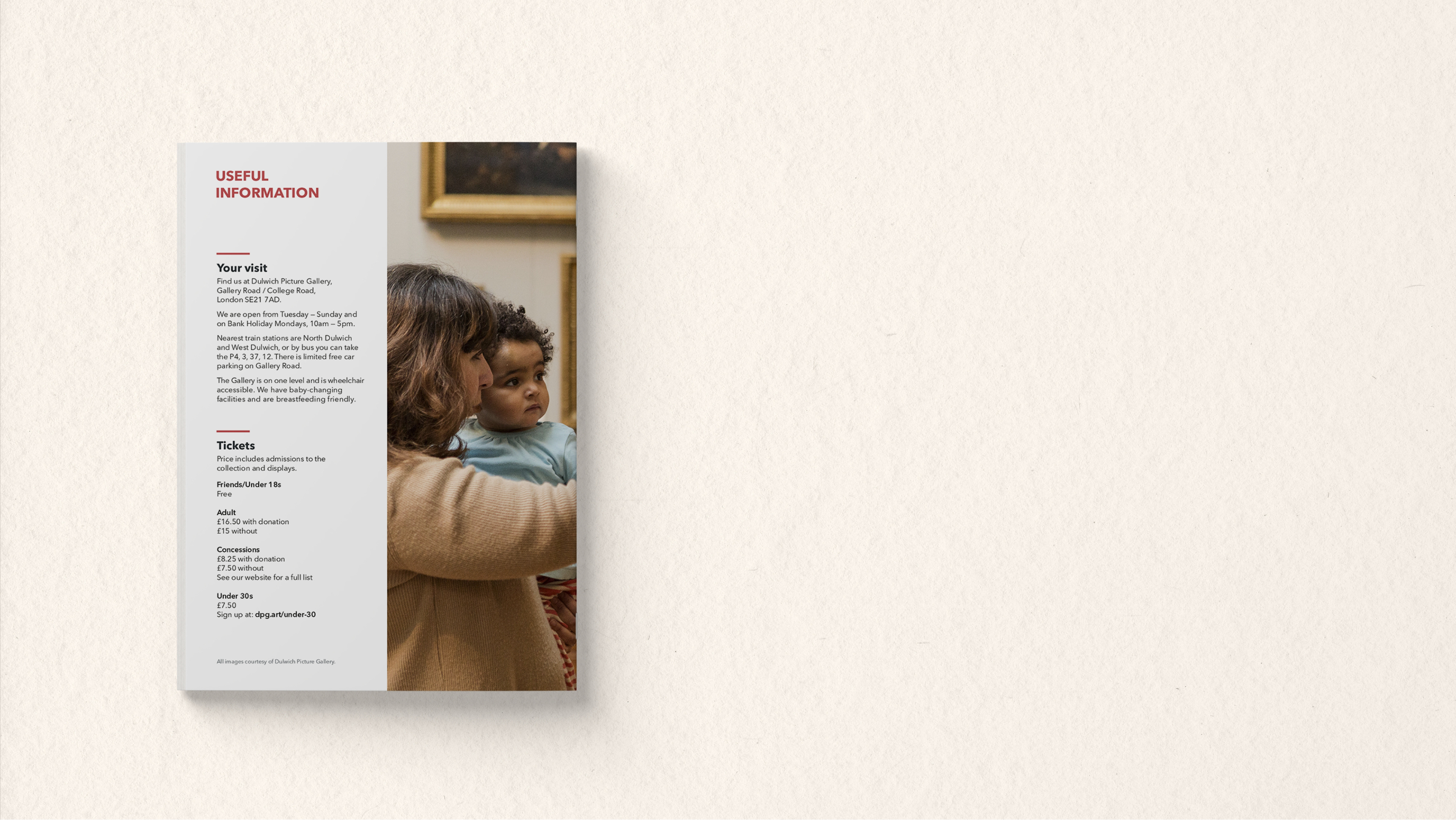
Back cover