
Back story
Co-founders Eva and Peter needed a brand identity to support the launch of their new co-working space in the heart of Oslo's arts district – Grünerløkka.
Their mission was born from a desire to create a space that not only supported the individual ambitions of their members but also promoted the value of collective sharing and collaboration within the community.
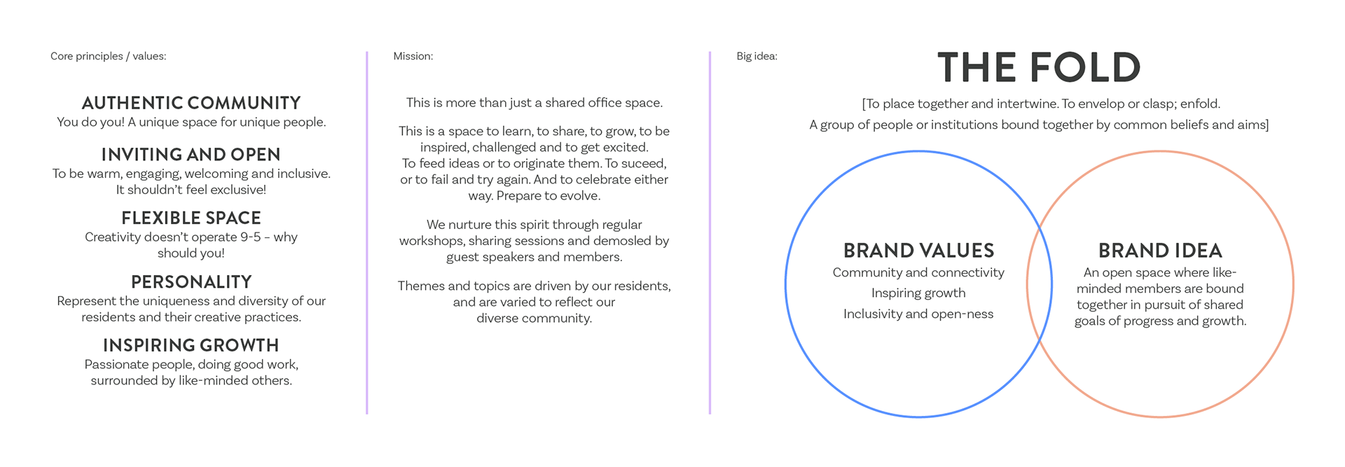
Brand mission and values
To support their new venture they approached me to establish their underlying principles and mission, develop a name for the space and create a supporting identity and visual language.
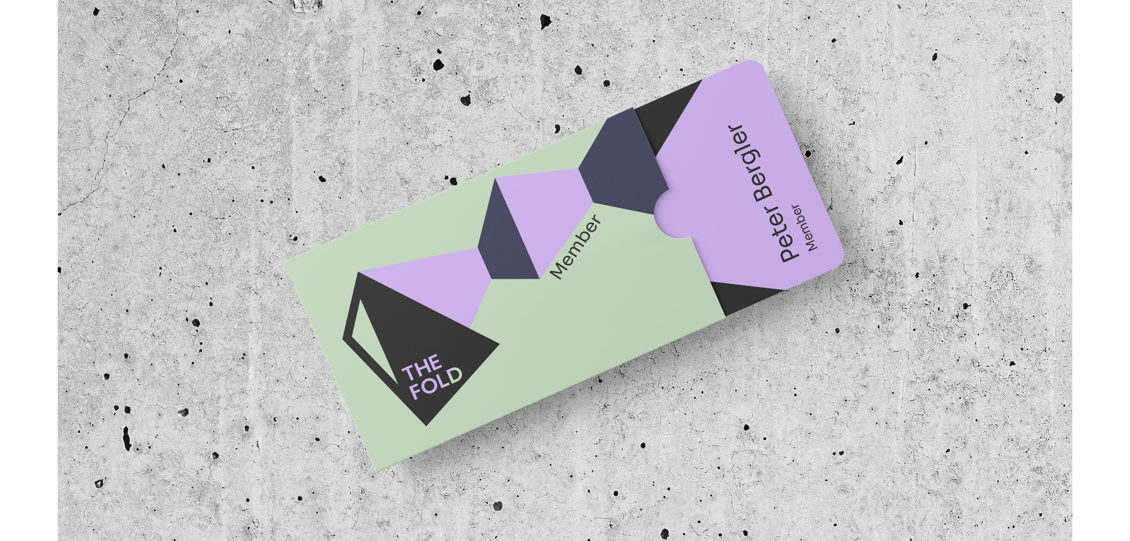
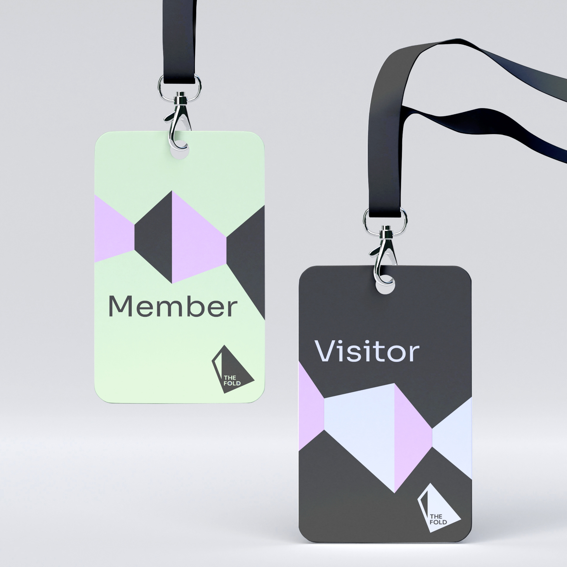
Membership card
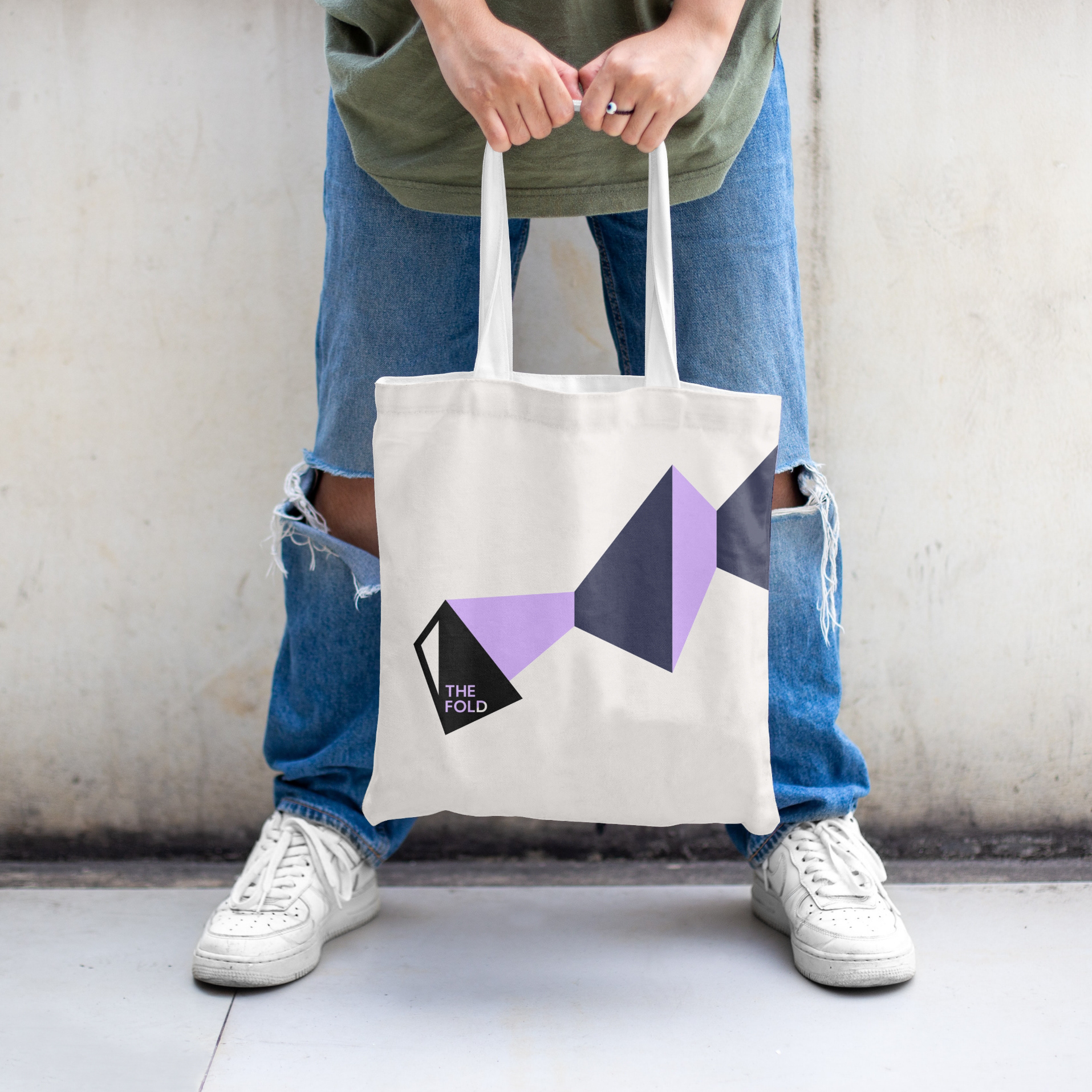
The resulting identity includes a bold angular logo marque which taps into the core of the brand principles. The type is enclosed and enveloped within the graphic form (which reflects the inclusivity of the space). Our logo form also has a clear 'window', reflecting the open-ness and the opportunity to engage with new perspectives, skills and creative practices within the community.
To support the primary logo, the visual language also includes bold angular forms, which suggest an 'unfolding' journey as well as diverse but connecting perspectives.
The colour palette is warm, welcoming and fun and used in bold forms throughout the brand. Vivid pastels have been paired with a rich navy and off-black.
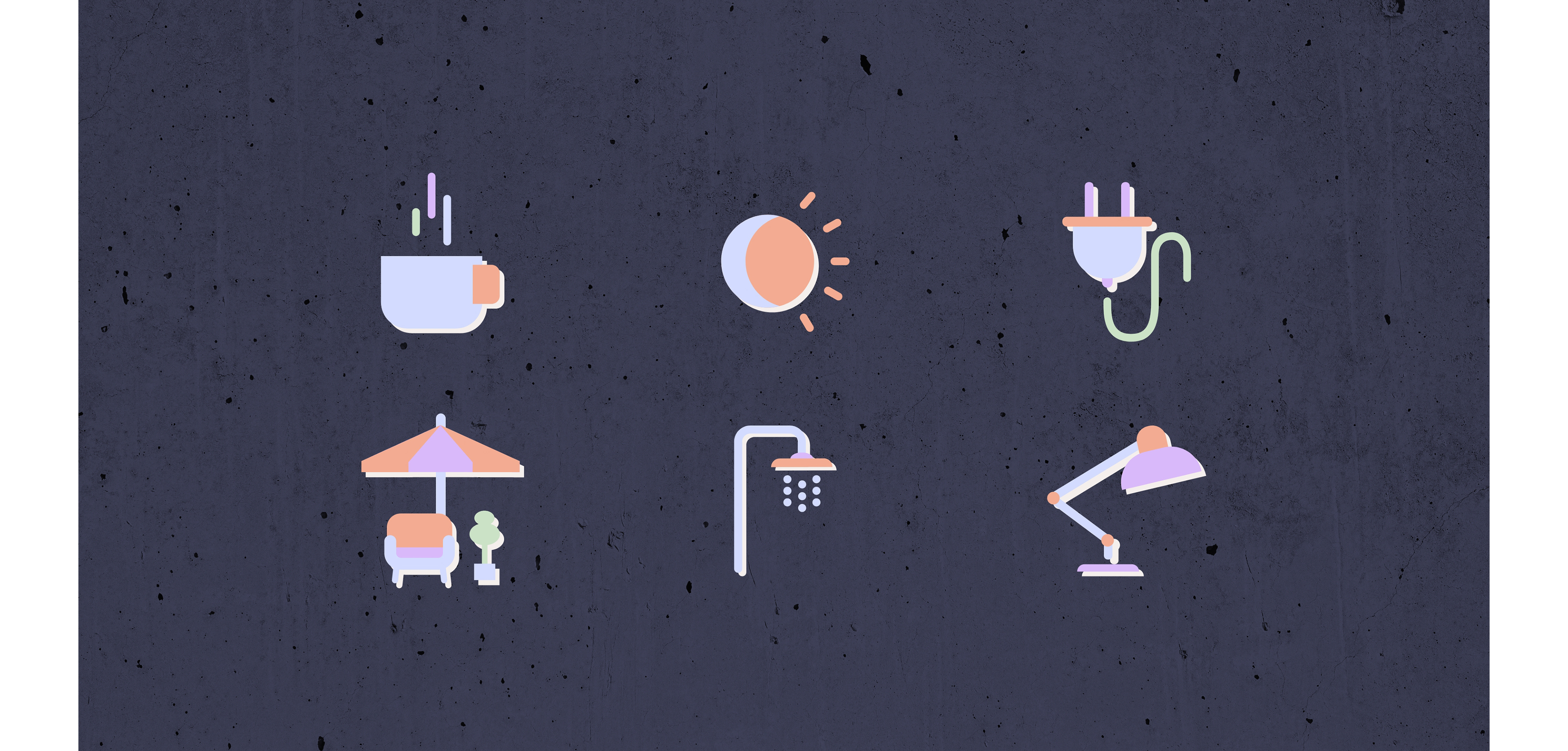
Website iconography
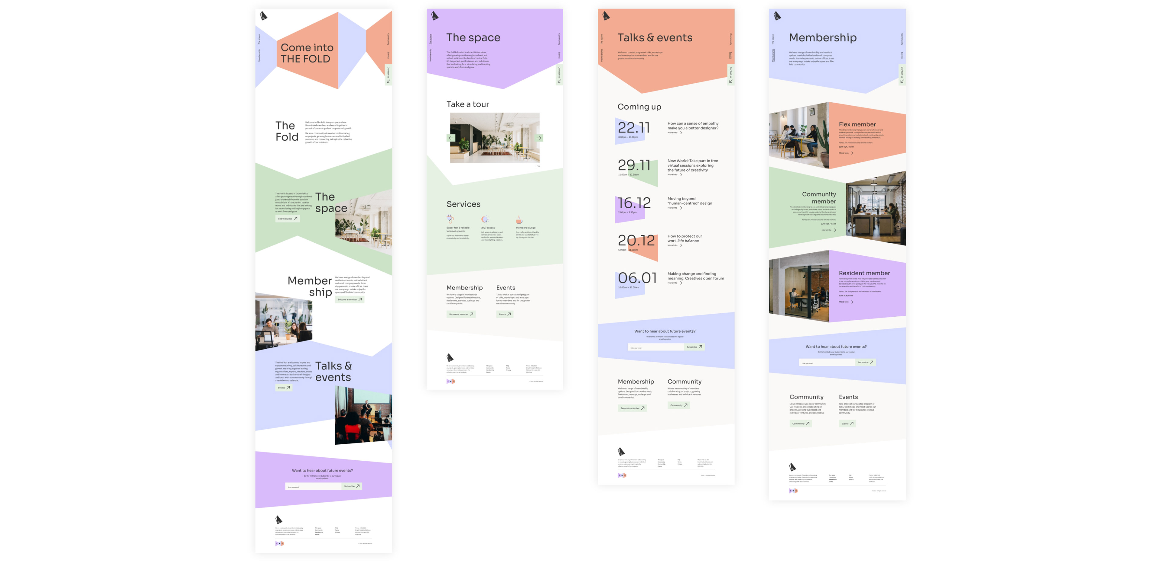
Website design

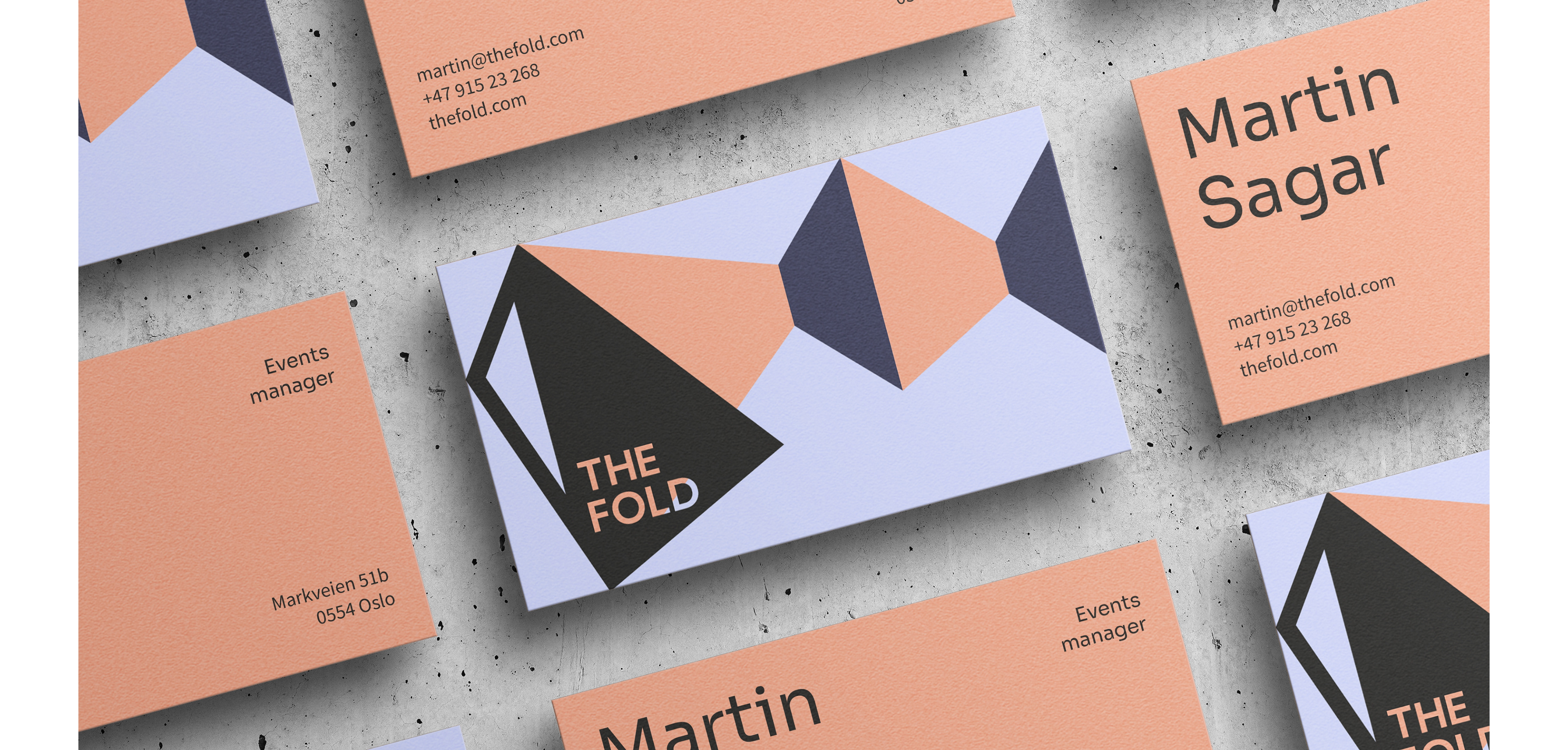
Business cards
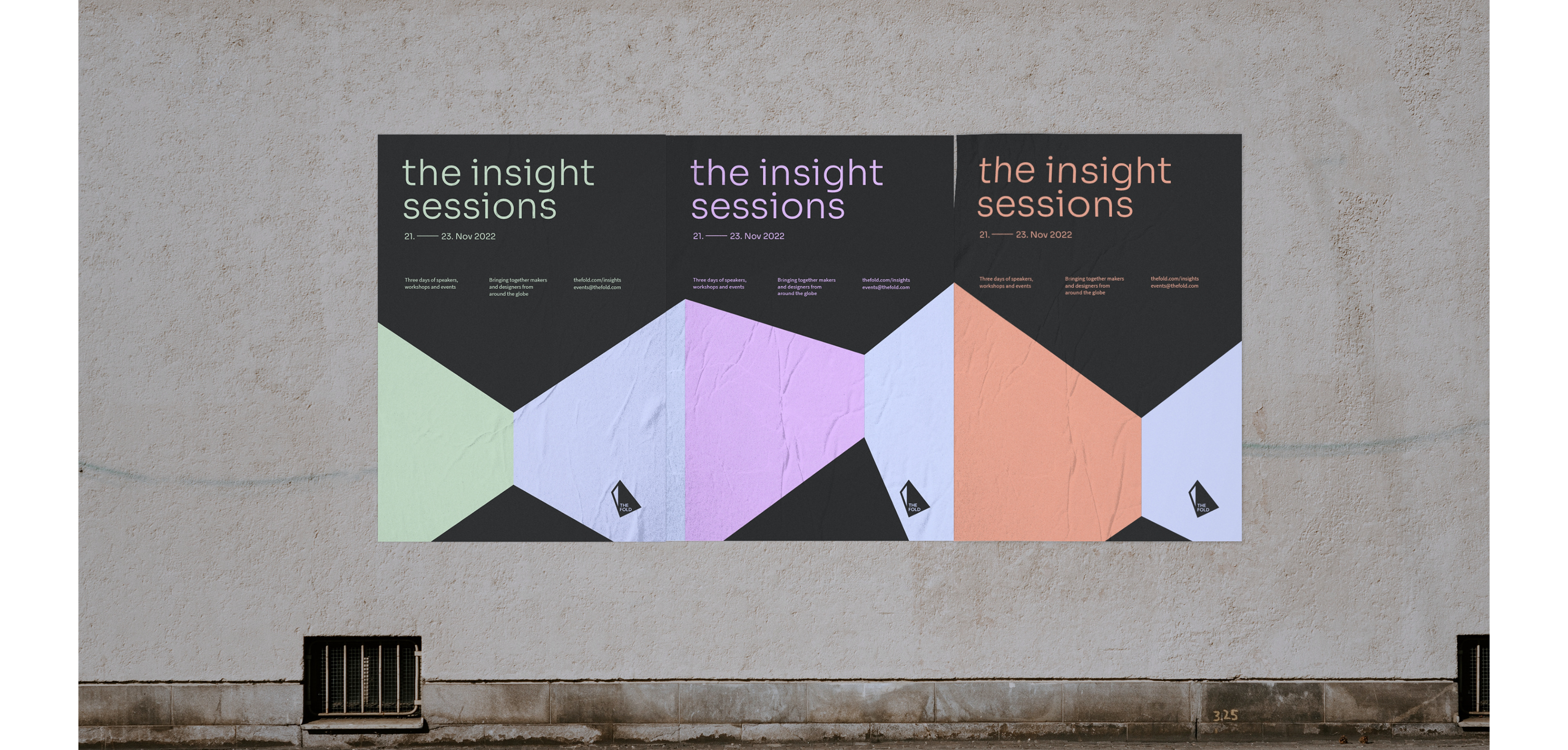
Event posters