Back story
Jacob opened a bakery to share his cinnamon rolls after the growing popularity of his unusual flavour combinations amongst family, friends and on Instagram.
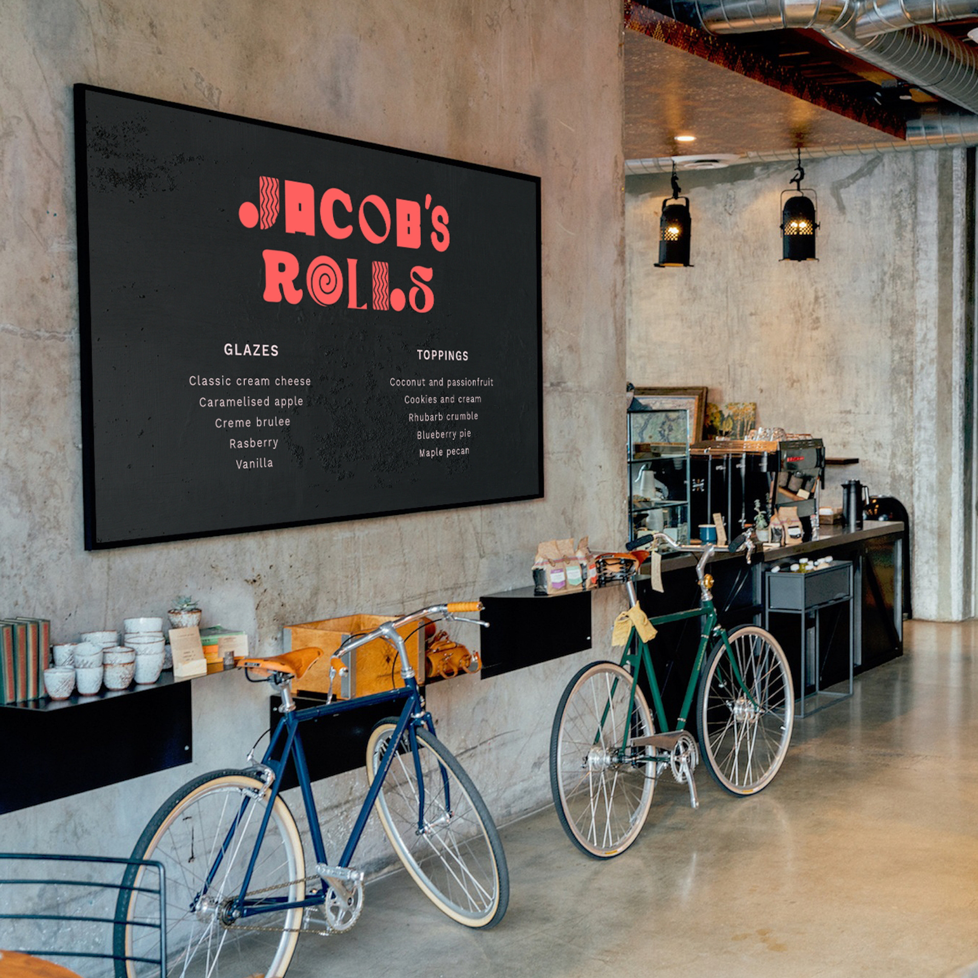
He wanted an identity and signage to reflect the quirky, playful and fun character of his special rolls.
Website design
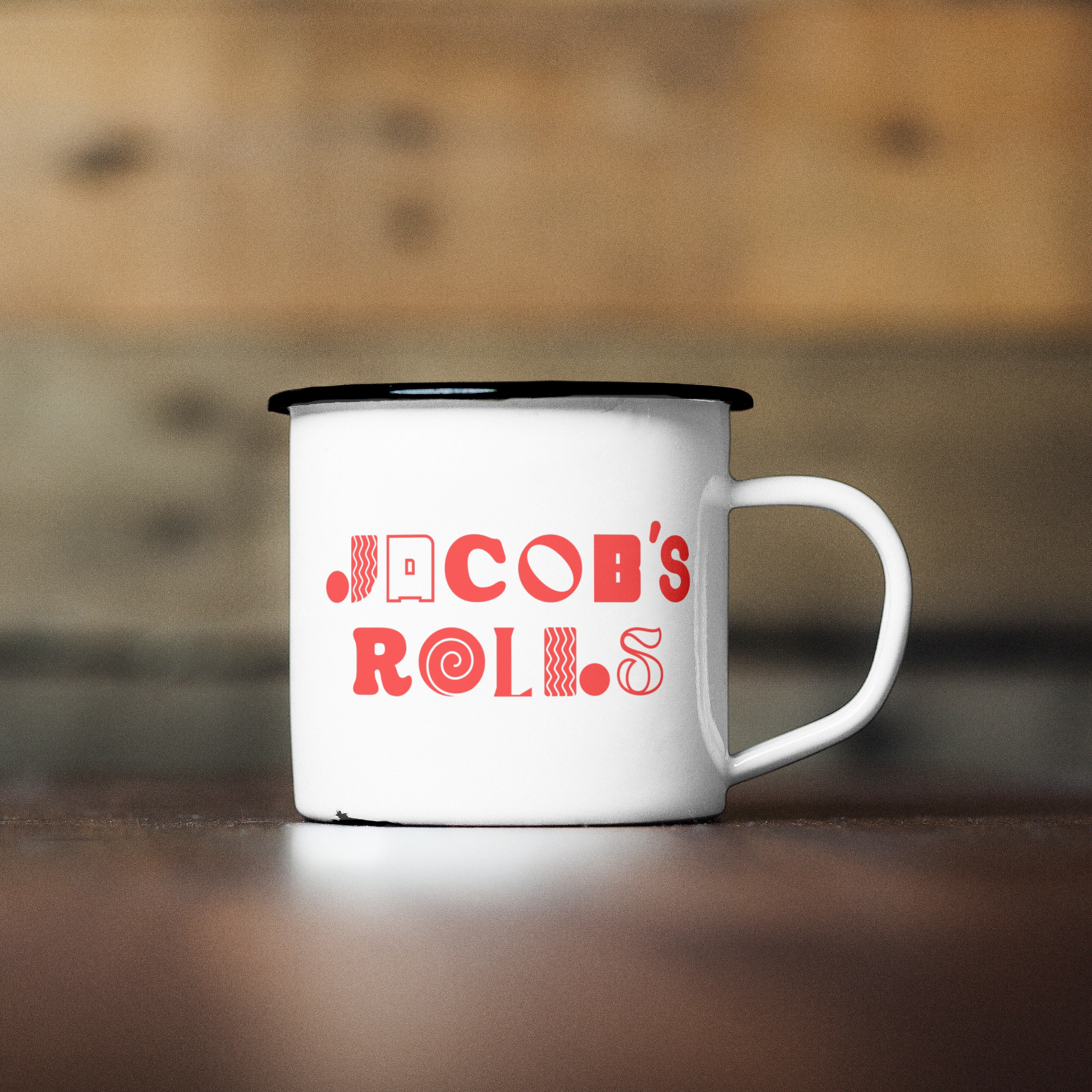
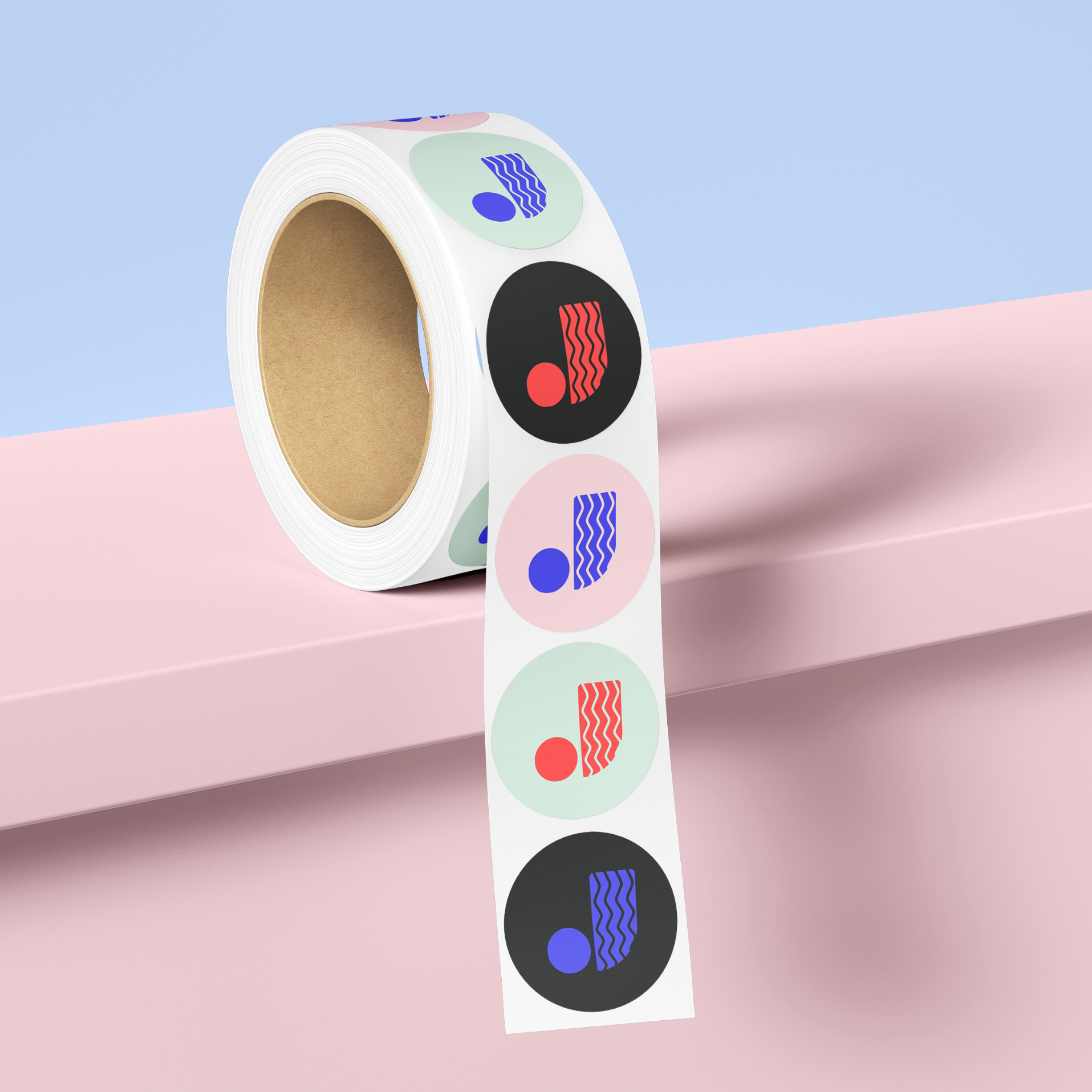
The resulting logo uses an eclectic and quirky typographic approach to reflect the playful flavour combinations. The colour palette is also warm, and comforting and sugary sweet.
T-shirt design for staff
The ones that got away...
Just some of the logo concepts that didn't come to full fruition...
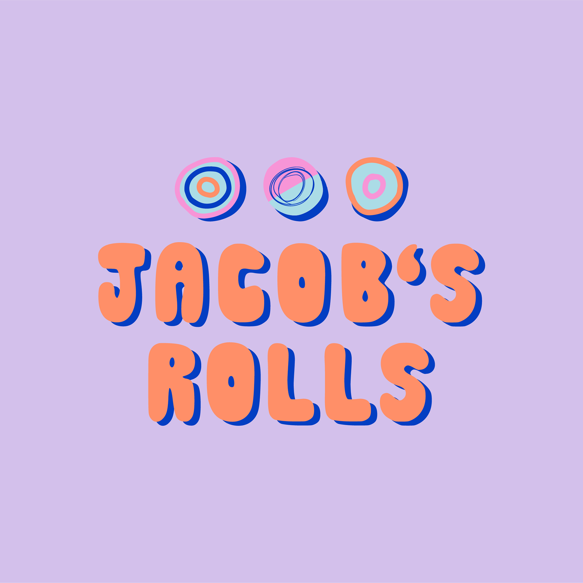
Alternative logo concepts
