Back story
Alice works across diverse mediums ranging from video art and moving image to animation, live action and installations. She wanted a clean and minimalist identity that would compliment, but not distract from, the visual impact of her work. Her approach is often tactile and textural, so she was keen to explore how this could be incorporated within the visual language of her brand whilst remaining professional.
Identity rollout across social media platforms
Business card design
The resulting identity includes subtle textural elements which are used sparingly, and work to support the clean logotype which is the principle identity marque. A minimalist colour palette is used to allow the vivid colours used throughout Alice's work to shine.
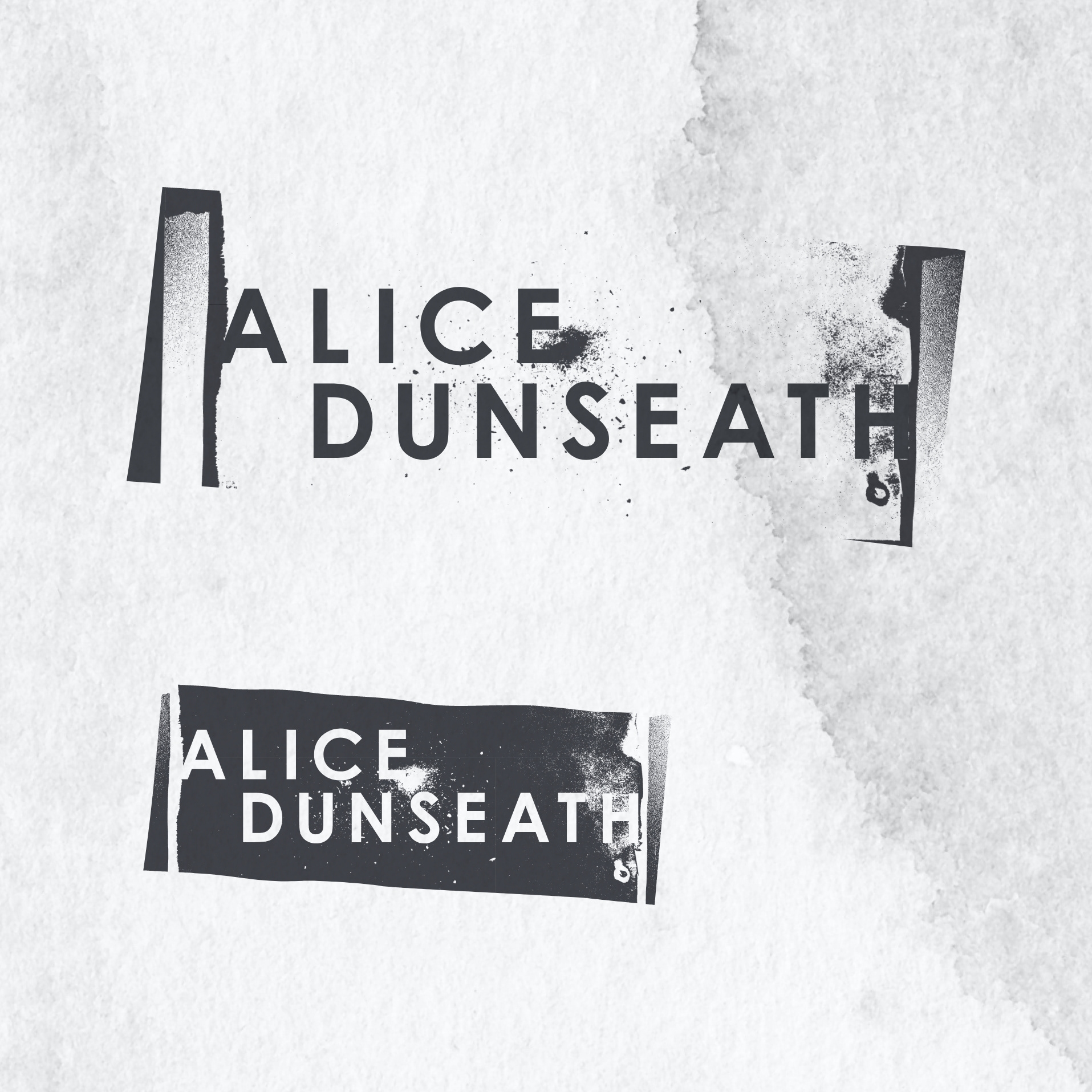
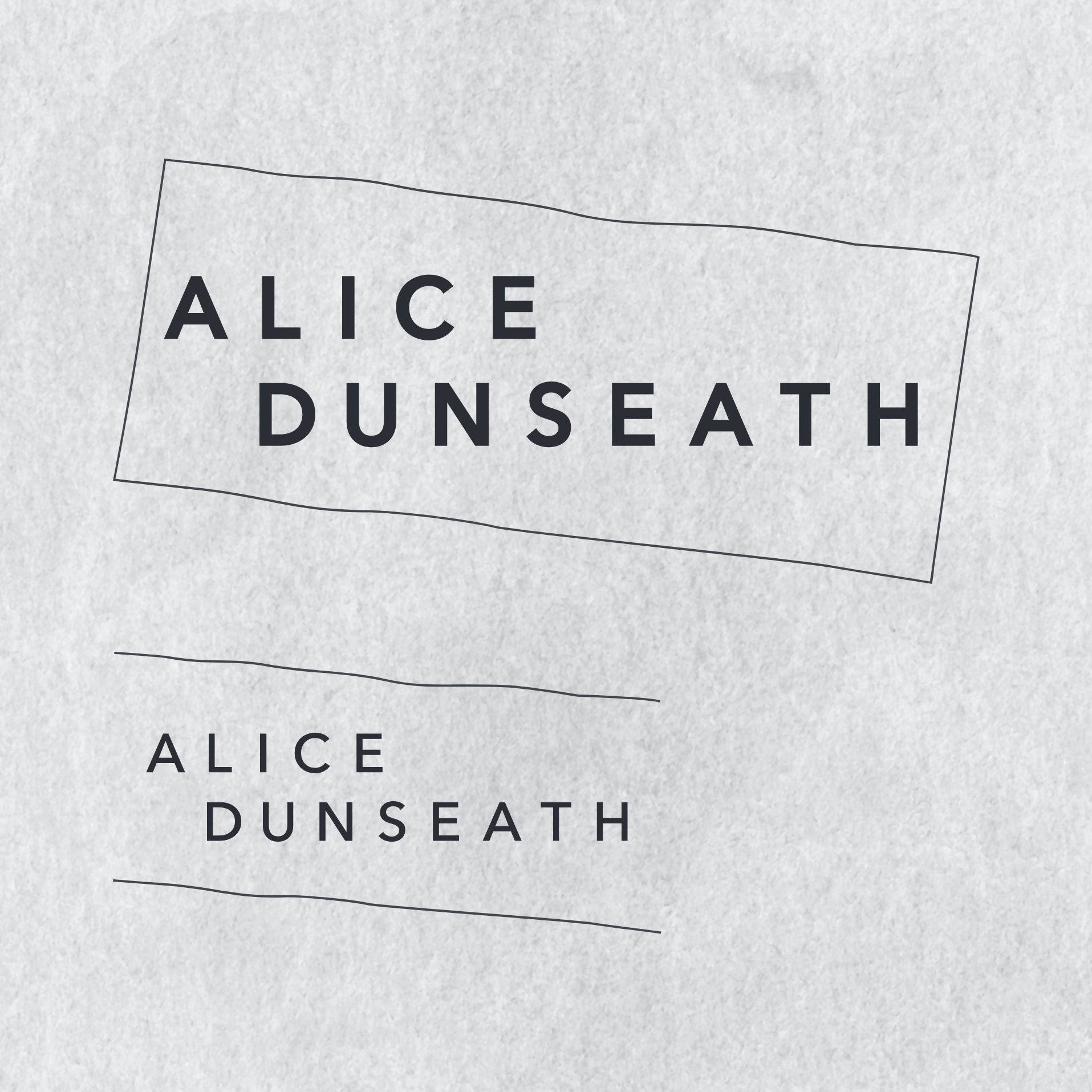
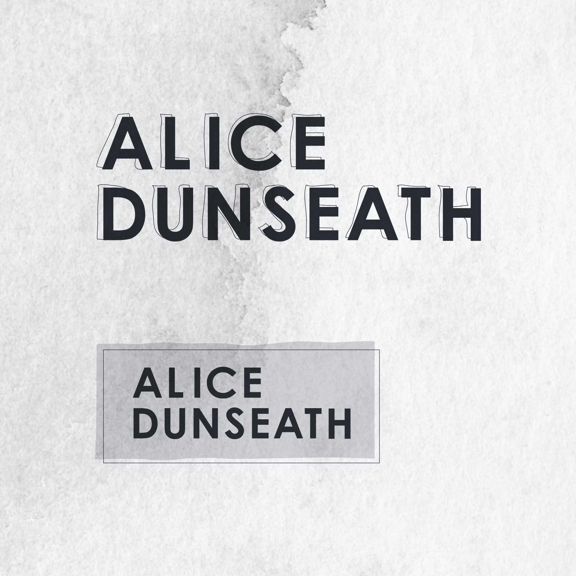
The ones that got away...
Just some of the logo concepts that didn't come to full fruition...


