
Back story
Dulwich Picture Gallery were approaching a significant milestone in their history – 70 Years of their 'Friends' membership program. To celebrate this, the Gallery planned to host a programme of special events throughout the year.
To support this they wanted a 'mini' visual identity that would promote the membership scheme, encourage new sign-ups and also recognise and celebrate current Friends.
As part of this identity they wanted to develop a special 'anniversary' edition of their membership logo, a distinctive colour palette and also a graphic treatment which could be utilised across multiple channels and communications.
Overall, there was a keen-ness for the identity to be engaging, fresh and impactful.
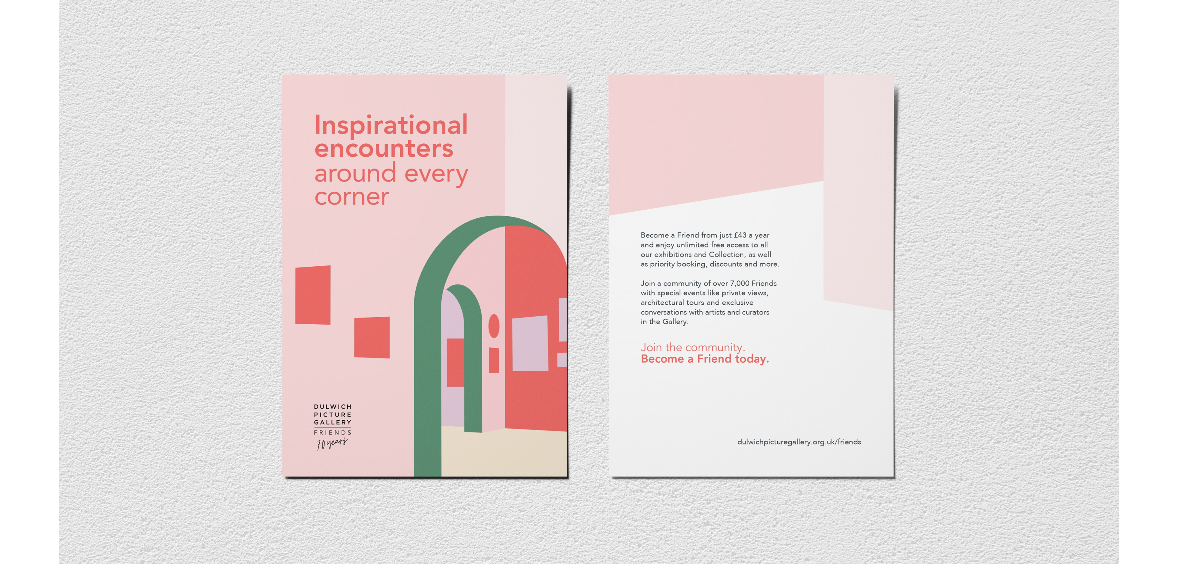
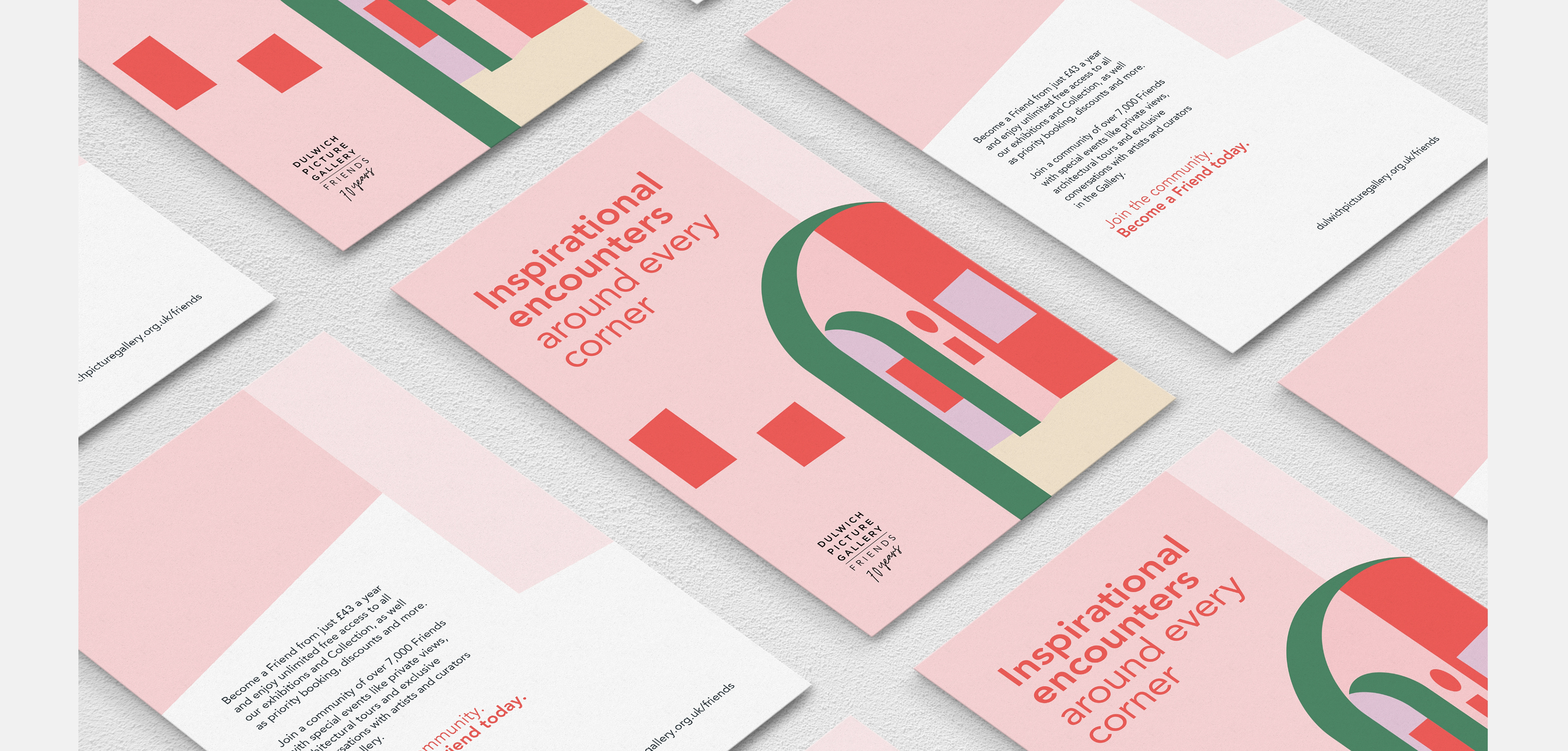
Promotional flyer
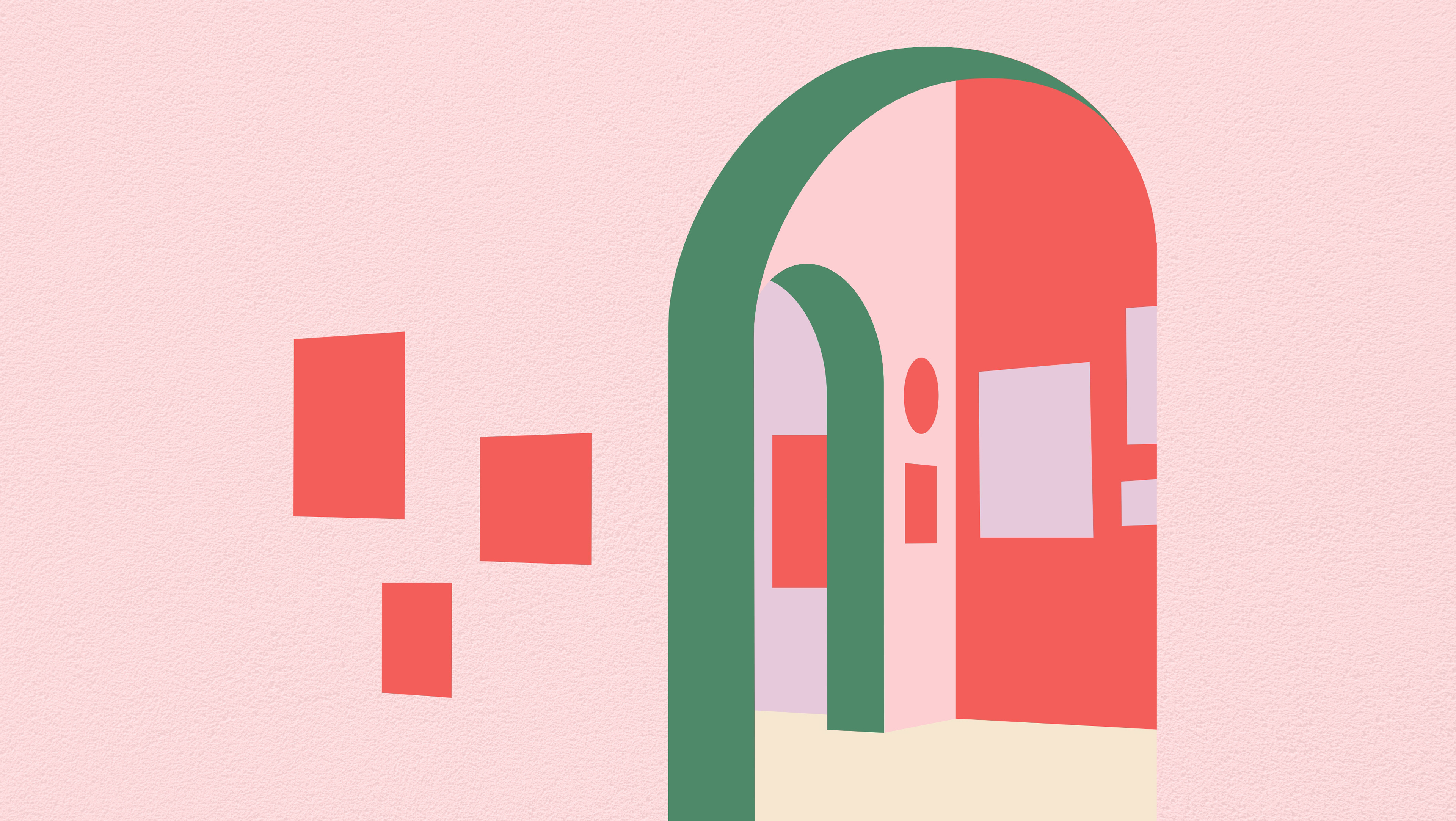
Concept: Inspirational encounters
The chosen creative concept is inspired by the bounty of experiences to be had when visiting Dulwich Picture Gallery. It is grounded in core aspects of the Gallery's 'Vision in Action' statements: ‘Find Yourself surprised by ‘oh-wow!’ visual encounters. Find Yourself at home in a space where you feel welcome’.
This is reflected through a simple illustrative expression of one of the gallery spaces. The suggestion being that there is a whole world of inspirational encounters waiting for you to explore.
The primary graphic treatment itself will resonate and feel familiar to existing members, but should also be intriguing and welcoming to audiences less familiar with the gallery spaces.
The creative approach is clean. A feeling of warmth, and of being ‘welcomed in’, is established by using more pastel tones.
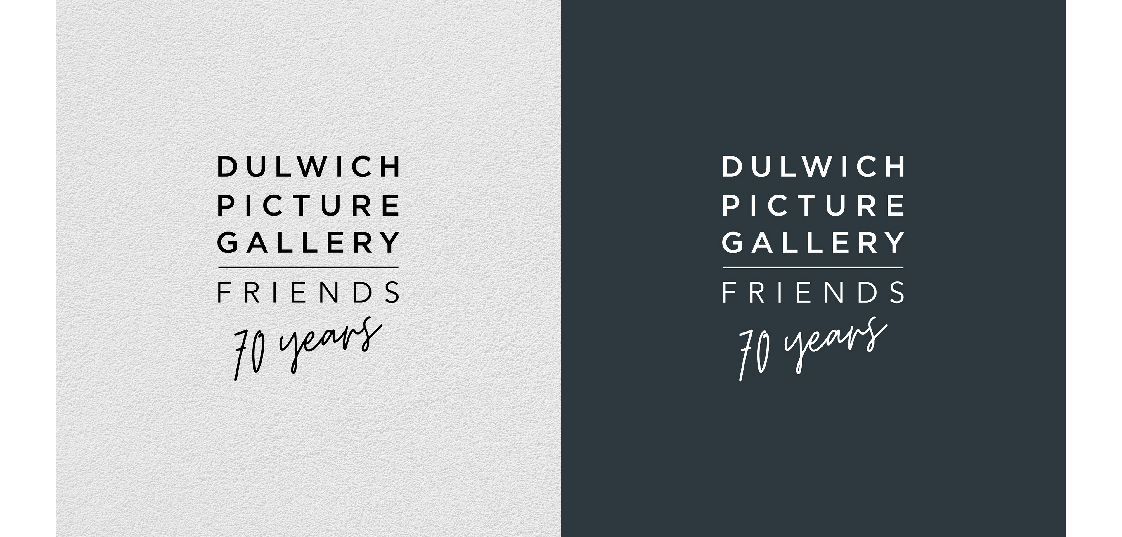
70 Years of Friends – Anniversary logo
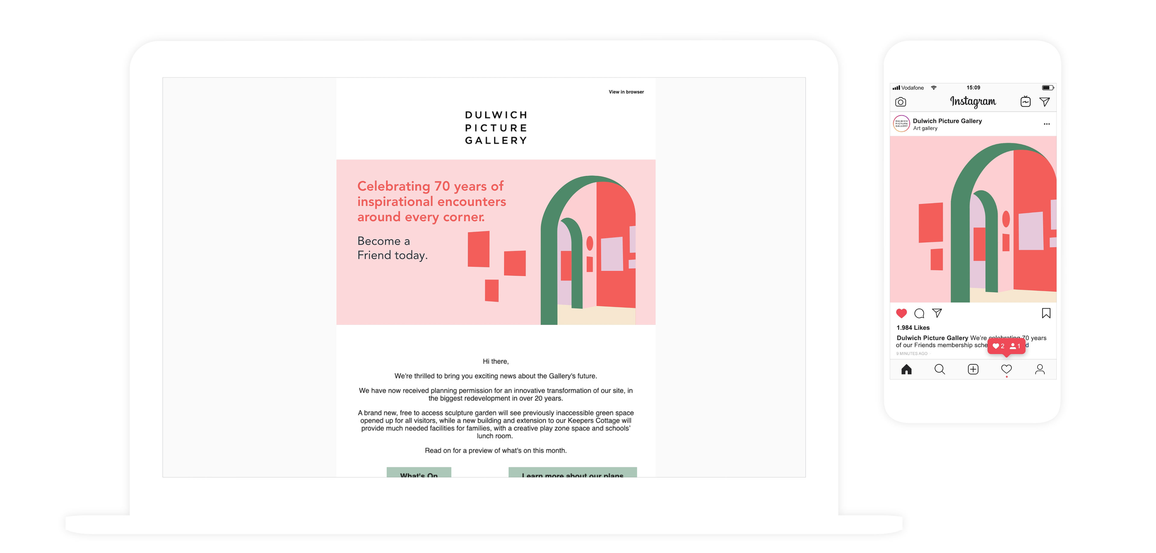
Email and social graphics
Promotional flyer
The ones that got away...
Just some of the concepts that didn't come to full fruition...
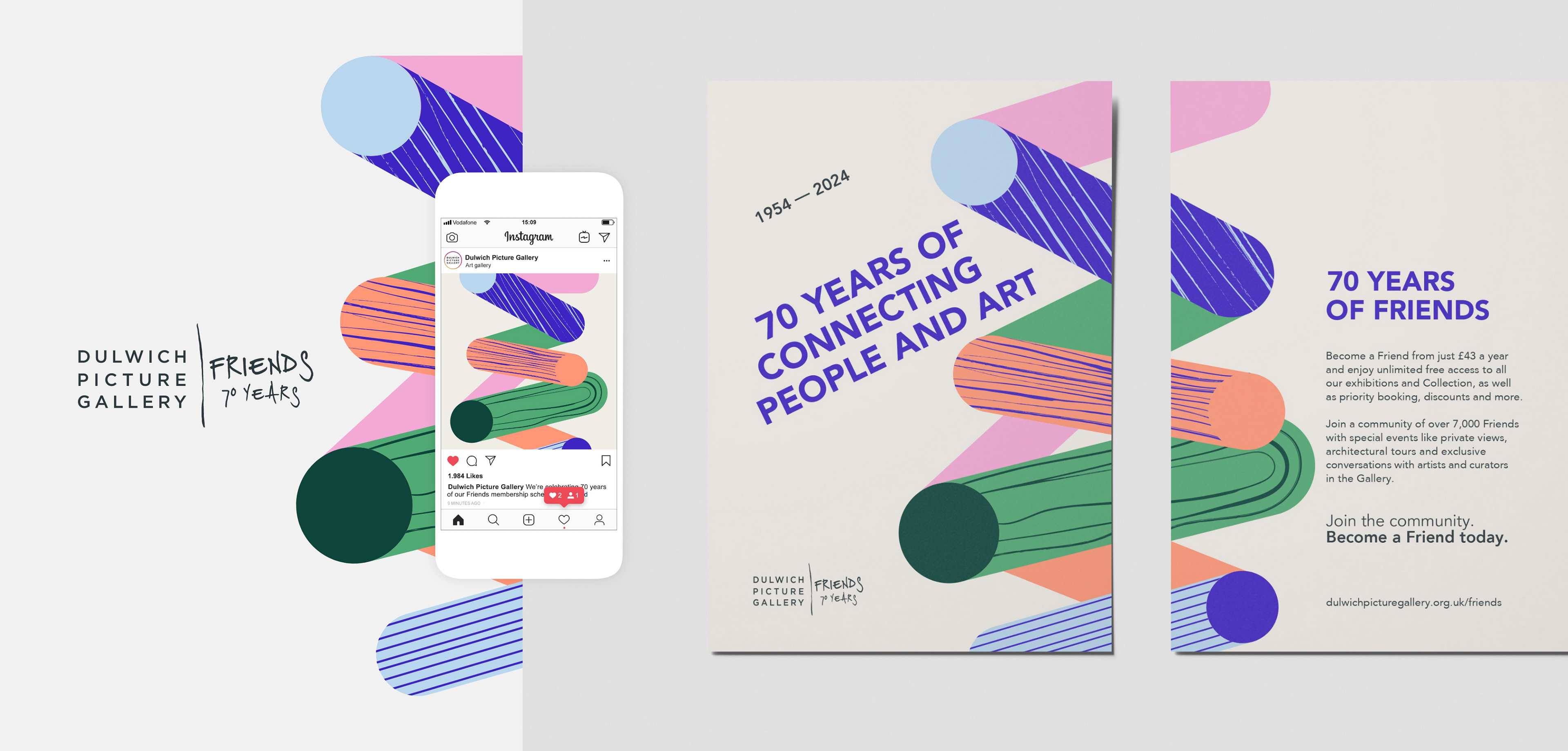
Connecting people and art
This creative concept is a more abstract reflection of the role played by Dulwich Picture Gallery in connecting people and art.
This is reflected through a dynamic and energetic collection of graphic forms, that are layered, connected and overlapping in dynamic angles. Bold and vibrant colours are used for each of the shapes, as well as textural elements that allude to the hand-made mark.
This ‘hand-drawn’ element is also utilised in the logo, again reflecting more personal and intimate interactions.
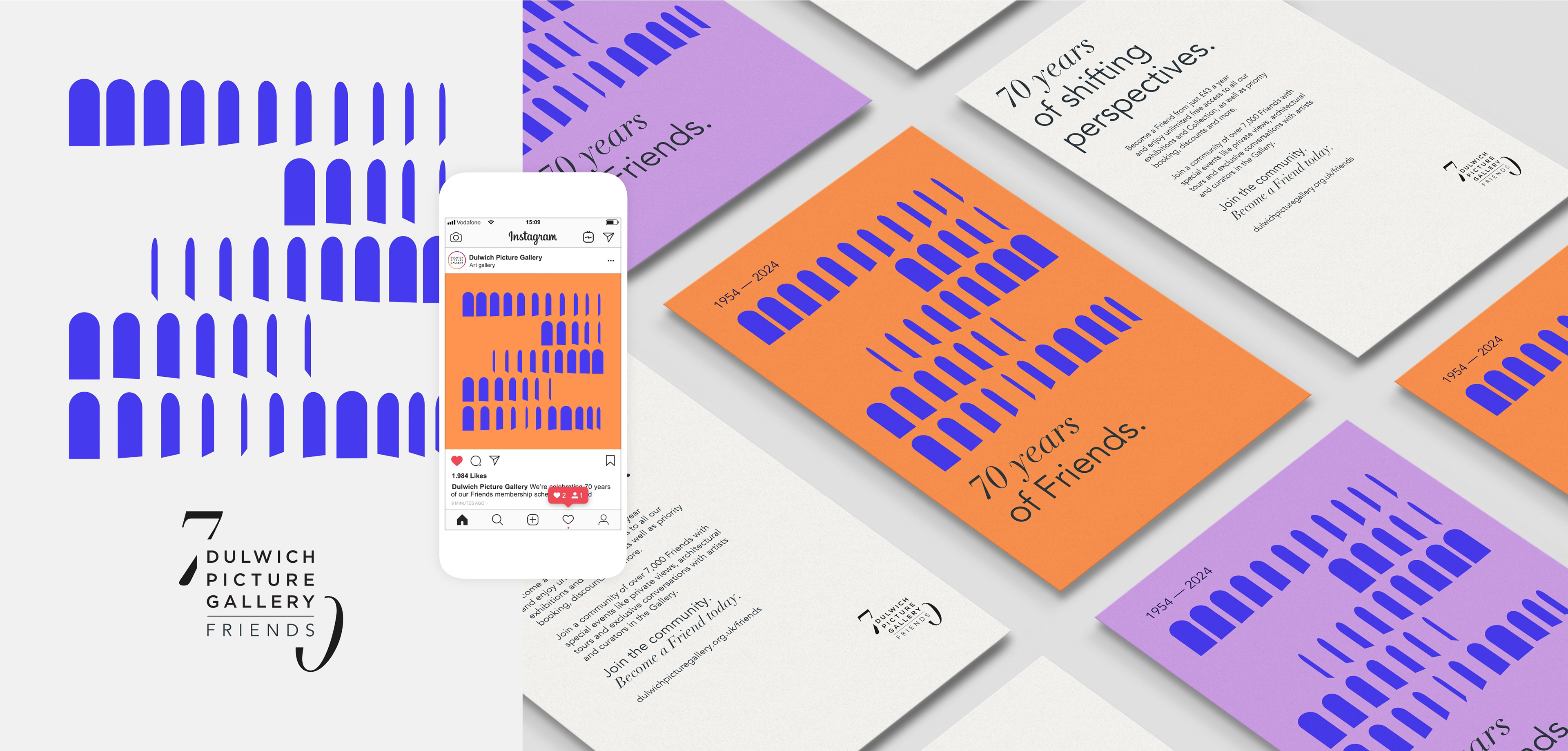
Shifting perspectives
This creative route reflects the relationship held between DPG and their loyal Friends, and the shifting perspectives, transformations and journeys that occur over time. It's also strongly rooted within one of the core aspects of DPG's vision statement: ‘Unlocking fresh perspectives through the art of the past and present’.
The primary graphic is inspired by the iconic arches seen across the grounds, in both the interior and exterior architecture. The individual arches skew and distort as though seen from different angles, and appear to evolve and transition within the graphic – creating an abstract geometric pattern.
A serif type-face has also been introduced to pair with the house font as a way to highlight the ‘70 years’ in a subtle yet classic and celebratory way.